How to Design a Coloring Book Cover

Sizes, DPI, layout and print tips.
Most people spend weeks creating the pages inside their coloring book, then rush the cover in an afternoon. It shows.
The cover is the first thing anyone sees. It determines whether someone picks up the book or leaves it on the shelf. And unlike the interior, where even imperfect line art can charm, a weak cover just looks unfinished.
The good news: you don't need to be a graphic designer. You need to make a handful of decisions correctly and avoid a handful of mistakes that trip up almost everyone. That's what this guide covers.
How to Choose the Right Size for Your Coloring Book Cover
Your cover isn't a standalone image. It's designed for a specific physical object, which means its dimensions need to match your interior pages exactly. Set up your canvas at the wrong size and everything downstream gets complicated.
The two most common formats for DIY coloring books are:
8.5 x 11 inches is the standard. Most home printers handle it natively, it's the default on most print-on-demand platforms, and it's the safest choice if you're unsure.
Square (8 x 8 or 10 x 10 inches) is worth considering if you care about how the book feels as an object. Square books feel more intentional, more balanced, like something you'd want to keep on a shelf. They also give your interior compositions more flexibility. The tradeoff: square formats are slightly less standard, so confirm your platform supports it before committing.
Whatever you choose, lock in the format before you design a single element. Reworking a cover to fit a different canvas after the fact usually means starting over.
What DPI Should a Coloring Book Cover Be?
Design your cover at 300 DPI minimum. If you can, go to 600 DPI.
Here's why this matters more for the cover than for the interior: the inside of a coloring book is black-and-white line art, forgiving by nature. A slightly soft line still reads as a line. The cover is different. Color, gradients, and detail all reveal compression and blur quickly once printed.
A cover that looks great on your monitor at 72 DPI will look noticeably different in print. The gap between 300 and 72 DPI isn't subtle, it's the difference between something that looks self-published and something that looks considered.
That said, resolution doesn't compensate for design. A poorly composed cover at 600 DPI is still poorly composed. Resolution protects good work; it doesn't create it.
Bleed and Margins: What Every DIY Publisher Needs to Know
Here's something that surprises first-time print designers: what you see on screen isn't exactly what gets printed.
Physical printing involves cutting paper in stacks, and small variations happen. If your background stops exactly at the page edge and the cut shifts even slightly, you get an unwanted white sliver along one side. It looks like a mistake, because it is one.
The fix is bleed. Extend your background about 0.125 inches (3 mm) beyond the final edge on all sides. Most design tools have a bleed setting; use it.
The flip side is the safe zone. Keep anything important (your title, faces, key visual elements) at least 0.25 inches inside the final edge. Think of the outer area as uncertain and the inner area as guaranteed. Design accordingly.
What Is the Wrap Area on a Book Cover?
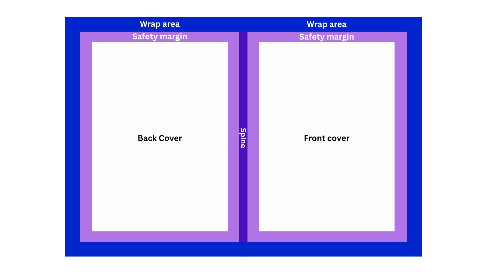
The wrap area is the total width of your cover file, combining the back cover, spine, and front cover into a single flat layout, plus the bleed on all outer edges. It is calculated as:
back cover width + spine width + front cover width + bleed
This full-width file is what printers use to produce and wrap the cover around your book block. The exact dimensions depend on your trim size, page count, and paper type, which determine the spine width. Because everything is printed as one piece, all backgrounds and visual elements must be designed to span this entire area seamlessly, while keeping important content away from trim lines and spine folds.
What Actually Makes a Coloring Book Cover Look Good
Good coloring book covers aren't impressive. They're clear.
When someone looks at your cover for three seconds, which is about all it gets, they should immediately understand what the book is about. No interpretation required.
One main visual element is almost always the right call. Multiple things competing for attention make a cover look busy. Pick one strong image and let it breathe.
Contrast is everything. If you include a title, it needs to be readable instantly. Dark text on a light background, or light text on a dark background. Anything in between risks looking muddy, especially at thumbnail size.
Design for small. If you're designing a digital product, most people will first encounter your cover as a tiny image, on a website, in a link preview, in a photo. If it only reads well when large, it's not working hard enough. Squint at it. Can you still tell what it is?
How to Choose the Best Image for Your Coloring Book Cover
You don't need to create something new. One of the strongest moves you can make is to use something you already have.
Take a drawing from inside your book, one of your best pages, and use it as the cover image directly, or simplify it slightly. It creates visual consistency between cover and interior, and it shows the buyer exactly what they're getting.
If this is a personalized coloring book made from photos, a stylized version of one of those photos can work extremely well as a cover.
What to avoid: highly detailed compositions that lose their punch at small sizes. Simpler shapes, cleaner backgrounds, and high contrast will outperform intricate detail almost every time.
Common Coloring Book Cover Mistakes (and How to Avoid Them)
None of these are hard to fix, but they're all easy to miss.
Low-resolution source images. Check your image resolution before you start. A beautiful photo at 72 DPI will look soft in print, regardless of how good it looks on screen.
Too many competing elements. A title, a subtitle, a logo, a border, multiple images, a tagline, any one of these can work. All of them together creates visual noise.
Text too close to the edges. Titles that drift into the trim zone risk getting cut off. Keep important text well inside the safe zone.
Thin decorative borders. These look crisp on screen and messy in print. If you use borders, make them substantial enough to survive slight alignment variation.
Weak contrast. Light grey text on white. Soft blue on pale yellow. These may look fine on a bright monitor but become nearly unreadable in print or at thumbnail size.
Designing the front cover separately. Because publishers require a single flat file, designing the front in isolation and assembling things later almost always creates alignment problems. Build your full spread from the start.
Step-by-Step Process for Designing a Print-Ready Coloring Book Cover
- Choose your binding type and confirm your page count, this determines your spine width.
- Download the cover template from your printing platform (KDP, Lulu, IngramSpark, etc.).
- Set up your canvas to match the template exactly, at 300 DPI or higher, with bleed included.
- Build your background across the full spread so it extends into the bleed area.
- Design the front cover: one strong visual, one clear title, high contrast.
- Check your composition at thumbnail size before exporting.
- Export at full resolution as a PDF, following your platform's exact specifications.
No step here is complicated. The key is doing them in the right order.
Create Your Coloring Book Cover Automatically with Memories in Lines
Everything in this guide takes time to get right. Choosing the correct canvas size, setting up bleed, checking resolution, each step is manageable on its own, but together they add up, especially when you're already focused on creating the pages inside.
That's exactly why we built the cover tool at Memories in Lines.
Upload one of your images and we automatically generate a print-ready cover. Correctly sized, properly margined, built at high resolution, and laid out as a full spread with front and back, not a rough draft you need to fix. A cover that's ready to upload directly to your printing platform.
You can swap the image any time, adjust the layout, and add a personalized title. If you're making a coloring book from personal photos, a gift, a family keepsake, something meaningful, this is the fastest way to go from images to a finished, printable book that actually looks the part.
Create your cover automatically
Frequently Asked Questions About Coloring Book Cover Design
What DPI should my coloring book cover be?
300 DPI is the minimum for print. For color covers, which show compression and blur more readily than black-and-white interiors, 600 DPI gives noticeably sharper results. If your design tool lets you choose, go higher.
What file format should I export my cover in?
PDF is the standard for most print-on-demand platforms and professional printers. It preserves your resolution, colors, and bleed settings exactly. Some platforms also accept high-resolution JPEGs or TIFFs. Always check your platform's submission guidelines before exporting.
Do I need to add bleed to my coloring book cover?
Yes, if any part of your design reaches the page edges, which it almost always does. Add 0.125 inches (3 mm) of bleed beyond the trim edge on all sides. Without it, slight variations in cutting can leave a thin white border along one or more edges.
What is the difference between RGB and CMYK for print?
Screens display color in RGB, but commercial printers use CMYK. The two color spaces don't map perfectly, and some bright RGB colors shift noticeably when converted to CMYK. If your platform accepts CMYK files, design in CMYK from the start. If not, preview a CMYK conversion before submitting so you're not surprised by the result.
What is a safe zone on a book cover?
The safe zone is the area inside your page where important elements are guaranteed to appear in the final print. Keep titles, faces, logos, and key visual content at least 0.25 inches from the trim edge. Anything closer risks being clipped if the cut shifts slightly.
Should I put a title on my coloring book cover?
It depends on what the book is. For a gift or personal keepsake, a title adds warmth and makes the book feel complete, a name, a date, a short phrase. For a product you're selling, a clear title helps people understand what they're looking at quickly. What to avoid: a title that's too long, too small, or placed so close to the edge that it risks being cut off.
What is the best font for a coloring book cover?
There's no single answer, but a few principles hold. Use a font that's readable at small sizes, ensure it has enough weight to show up against your background, and keep it to one or two typefaces maximum. Decorative or handwritten fonts can work well for the title if they suit the mood of the book, just make sure they're still legible. When in doubt, a clean sans-serif with strong contrast will look more professional than a fancy font that's hard to read.
Should I use a photo or an illustration for my coloring book cover?
Both can work. A photo feels immediate and personal, good for gifts and custom books. An illustration feels more like a product, better if you're selling through a store. The more important question is whether the image reads clearly at small sizes. Shrink it down to roughly 200 x 300 pixels and see if it still communicates something. If it just looks like a blur of detail, simplify.
Can I design my coloring book cover in Canva?
Yes, with caveats. Canva works for cover design, but you'll need to set your canvas to the correct dimensions manually (including bleed), use only high-resolution images, and export as a high-quality PDF. Canva's default export settings aren't always print-optimized, so check the export options carefully. Canva also works in RGB, if your platform requires CMYK, you'll need to handle that conversion separately.
How does Amazon KDP handle coloring book cover files?
KDP requires a single flat PDF containing your full cover, back, spine, and front laid out side by side. They provide a cover calculator on their website where you enter your page count, paper type, and trim size, and it generates a template with exact dimensions and guides. Download that template before you start designing.
Next in the seriesHow to Design a Coloring Book Spine