How to Design the Back Cover of a Coloring Book

Front covers get all the attention. Spines get a careful paragraph. Back covers get whatever is left at the end of a tired evening, usually a centered sentence, a barcode, and a lot of empty paper.
That is a missed opportunity, and for personalized coloring books it is the single biggest reason a book that should feel like a keepsake ends up feeling like a print job.
This guide is the version we wish we had when we started designing covers in volume. It skips the generic publishing advice and focuses on what actually changes how a back cover reads, prints, and feels in someone's hands.
What the Back Cover Actually Does
For a normal book, the back cover sells. For a personalized coloring book, the back cover does something different, and most templates online get this wrong because they were designed for novels.
A personalized coloring book is almost never picked up by a stranger in a bookstore. It is opened by someone who already knows what it is, whether a parent, a grandparent, a partner, or the person whose photos are inside. They are not deciding whether to buy it. They are deciding how to feel about it.
That changes everything. The back cover is not a sales pitch. It is the closing line of a short story. Its job is to land the emotion the front cover set up quietly, in one breath.
Once you accept that, most "back cover best practices" stop applying. You don't need a blurb. You don't need bullet points of features. You don't need testimonials. You need one image, a few honest words, and enough white space that the page feels intentional rather than empty.
The Four Zones (and Why Three of Them Should Stay Mostly Empty)
Stop thinking of the back cover as a panel to fill. Think of it as four zones, where the goal is to leave most of them quiet on purpose.
Zone 1: Top breathing space. The top quarter of the back cover should usually be empty or hold a single small image. This is the rarest piece of advice you will find online, and it is the one that separates amateur back covers from finished ones. Front covers tend to be visually heavy at the top. The back cover balances the spread by being lighter up there.
Zone 2: The dedication zone. This sits in the upper-middle of the back cover, not dead center. Center-aligned text in the exact vertical middle reads as default-template energy; pulling it up by about ten percent makes the page feel composed rather than auto-generated.
Zone 3: The signature line. A single line near the bottom-left: a name, a date, a city, or all three in small type. This is the part that turns the book into an artifact twenty years from now.
Zone 4: The barcode safe area. Lower right, roughly 2 x 1.2 inches, completely untouched. Even if you are not using an ISBN, leaving this area clear keeps the layout asymmetrical in a way that reads as designed.
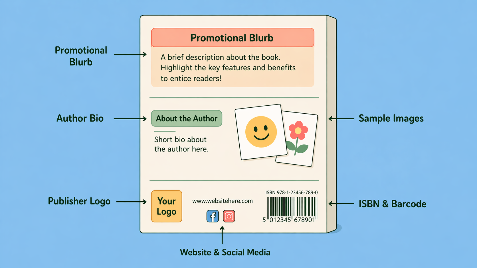
Notice what is not on this list: a synopsis, a bio, a logo lockup, social media icons, a QR code. None of them belong on a personalized coloring book. They are leftovers from publishing templates that assumed a stranger was holding the book.
Dedication Formulas That Actually Work
The hardest part of any back cover is the dedication. Most people either freeze and write nothing, or write a paragraph that sounds like a greeting card. Neither lands.
After looking at thousands of personalized covers, three patterns consistently outperform free-form writing:
The "for / because" formula. One line of who, one line of why. "For Mum, because every one of these started with you." It works because it forces specificity without forcing prose.
The dated note. A single sentence followed by a place and date on its own line. "Thank you for the summer. Lisbon, August 2026." It feels like the inside cover of an old novel because that is exactly the convention it borrows from.
The shared phrase. A line that only the recipient will fully understand, like an inside joke, the first words of a song, the name of the road they grew up on. This is the most powerful and the most underused. The back cover is the one place in the book where you can address one person and ignore everyone else.
What does not work: long paragraphs, anything that explains the book ("this book is a collection of moments…"), and anything written in the third person. If it sounds like marketing, cut it.
The Image Decision: One, None, or a Pattern
The single biggest visual mistake on back covers is putting four small preview images in a grid. It looks like a contact sheet, signals "made in a template," and immediately makes the cover feel cheaper than the book inside it.
You really only have three good options:
One image. A single line-art preview from inside the book, sized small, placed in the top breathing zone. This works in roughly 70% of cases.
No image at all. Just the dedication, the signature line, and a solid background that matches the front. This is harder to do well but, when it works, is the most premium-feeling option. It treats the back cover the way a hardback novel does, as a quiet finish, not a second front.
A repeating pattern or motif. A small recurring element, such as a flower, a wave, or a star, pulled from one of the interior pages, used at low opacity behind the text. This is the option to choose if you want texture without competing with the dedication.
Anything else, like a grid of thumbnails, a montage, or a hero image as big as the front cover, almost always reads as overdesigned.
Matching the Front Without Mirroring It
The back cover should clearly belong to the same book as the front, but it should never look like a duplicate of it. The trick is to match the underlying language while changing the volume.
Same background, half the contrast. If your front cover is full-bleed cream with a high-contrast title, your back cover should be the same cream, but with everything dialed down. Smaller type, looser spacing, no headline.
Same typeface, different weight. If the front uses a bold display weight, the back should use the same family at a lighter weight, smaller size. This keeps the system intact while making the back feel like an aside, not an announcement.
Same accent, used once. If the front uses an accent color (a coral underline, a gold star), let it appear exactly once on the back, under a name, around a date, or as a single small mark near the dedication. Used twice it becomes decoration; used once it becomes a signature.
Print Details That Quietly Ruin Back Covers
Most back-cover problems are not visible in the design file. They show up when the book arrives.
The dedication drifts into the spine. On softcover books, the back cover bends slightly toward the spine when the book is closed flat. Anything within about 0.4 inches of the spine edge will visually crowd the fold even though it looks fine in the file. Keep the dedication block more inset than feels necessary.
Dark backgrounds reveal scuffing. A solid black or deep navy back cover looks beautiful on screen and shows every fingerprint and scuff in real life. Personalized coloring books are handled, and kids handle them especially. Mid-tones (cream, dusty rose, sage, slate) age dramatically better than saturated darks.
Type size that looked fine on screen prints small. A dedication set at 11pt on a 27-inch monitor at 100% zoom looks generous. Printed at 8.5 x 8.5 inches, it can read as cramped. For body text on the back cover, 12-13pt is the floor. For the signature line, 9-10pt.
Letter spacing on small caps. If you set "FOR MUM, AUGUST 2026" in all caps without adding 5-10% extra letter-spacing, it will look stamped rather than typeset. This is one of those one-percent details that print-savvy designers do automatically and most templates ignore.
The barcode color trap. If you do use an ISBN, the barcode area must have a light background or the scanner cannot read it. A dark back cover with a white rectangle dropped in the corner for the barcode looks like a sticker. Either keep the lower-right corner naturally light, or skip the ISBN for personal projects.
The Bleed and Safe Zone, Briefly
The technical setup is the same as your front cover, with one addition specific to the back:
- Bleed: 0.125 inches (3 mm) on the outside left, top, and bottom edges. The right edge meets the spine and is handled by the spine strip.
- Safe zone: keep all text and meaningful imagery at least 0.25 inches inside the trim.
- Resolution: 300 DPI minimum, 600 DPI ideal, same as the front.
- One extra rule for the back: keep important content at least 0.4 inches off the spine edge to avoid visual crowding when the book is closed.
A Compact Process That Works Every Time
- Open the full-spread cover template from your printer (KDP, Lulu, IngramSpark) so the back, spine, and front all live in the same file.
- Carry your front cover background across the entire spread, including the back, before you do anything else. This locks the system in place.
- Block out the four zones on the back cover: breathing space, dedication, signature, barcode safe area.
- Write the dedication using one of the three formulas above. Keep it under 25 words.
- Decide on image, pattern, or nothing. When in doubt, choose nothing.
- Place the signature line bottom-left, small, not centered.
- Step away for an hour, come back, and remove one element. Almost every back cover gets better with one fewer thing on it.
- Export the full spread as a single flattened PDF at 300 DPI or higher.
Let Memories in Lines Handle the Layout
Most of what makes a back cover work, including the four zones, the asymmetry, the matched-but-quieter system, and the safe area for the barcode, is geometry, not creativity. We do that part for you automatically.
You upload your photos and write your dedication. We generate a print-ready full spread (front, spine, back) sized correctly for your page count, with the back cover laid out using the principles in this guide. You can swap images, edit the dedication, and adjust placement, and the file is ready to upload to any major printing platform.
Design your cover at memoriesinlines.com/workspace
Frequently Asked Questions About Coloring Book Back Cover Design
Do I really need anything on the back cover of a personalized coloring book?
No, and that is the most underused option. A solid background that matches your front cover, with nothing on it except a small signature line at the bottom, is a perfectly valid back cover. It is also one of the most premium-feeling choices, especially for gift books that are not being sold commercially.
Where should the dedication go?
Slightly above the visual center, not in the exact middle. Dead-center text reads as a default template; pulling it up by roughly ten percent of the cover height makes the page feel composed. Left-align or center-align the text itself depending on the front cover's alignment, and keep it short, under 25 words is a good ceiling.
Should I include a preview image of the inside?
One small image, or none. Never four in a grid, since that is the single most common mistake and the one that most reliably makes a back cover look amateur. If you do include a preview, place it in the upper portion of the back cover and keep it smaller than feels necessary.
What about my logo, website, or social handles?
Skip them on personalized coloring books. They are conventions borrowed from commercial publishing and they immediately make a personal gift feel like merchandise. If the book is a paid product you are selling, a small wordmark at the bottom is fine, but keep it understated.
Where exactly does the barcode go and how much space does it need?
Lower right corner of the back cover, roughly 2 x 1.2 inches, with a light background underneath it so the scanner can read it. Most print-on-demand platforms place it automatically, so leave the area clear in your design rather than putting content there you will have to move later.
Do I need an ISBN for a personalized coloring book?
Only if you are selling through retail channels like Amazon KDP or IngramSpark. For personal gifts, family projects, or print-on-demand services that allow non-retail printing (such as Lulu's private projects), you do not need an ISBN, and skipping it lets you design the lower-right corner freely.
What font size should the dedication be in print?
12-13pt for the dedication itself, 9-10pt for a signature line below it. Dedications at 10-11pt look generous on screen and print noticeably small. If you are setting anything in all capitals, add 5-10% extra letter-spacing or it will look stamped rather than typeset.
How do I keep the back cover from looking like a different design from the front?
Use the same background color, the same typeface, and the same accent color, but quieter. Smaller type, lighter weight, no headline, and the accent used only once. The goal is the same visual language at half the volume, not a duplicate of the front.
Next in the seriesHow Thick Should Coloring Book Paper Be? A Practical Guide